Coyles
Humanizing a Recruitment Giant
Role
Lead Designer
Scope
Brand Identity, Web Design, Print
Platform
Corporate Web Platform
The Vision
Coyle Personnel is one of the UK's top privately-owned recruitment agencies, covering a massive array of diverse sectors. The goal of this project wasn't just a website refresh; it was a holistic, ground-up overhaul of their entire brand identity. From the logo to print materials and the massive digital platform, the objective was to unify their presence into a singular, cohesive ecosystem.
Process & Architecture
With a platform of this scale, pushing pixels without a solid foundation would have compromised the entire user experience. During the initial research and wireframing phase, I heavily prioritized building a bulletproof sitemap. Because Coyles spans so many distinct industries, establishing an organized structural logic early on was crucial. Furthermore, the design process required careful navigation of internal systems, actively pitching and securing approvals from multiple distinct departments to ensure the overarching structure worked for every branch of the business.
UX
The Visual Identity
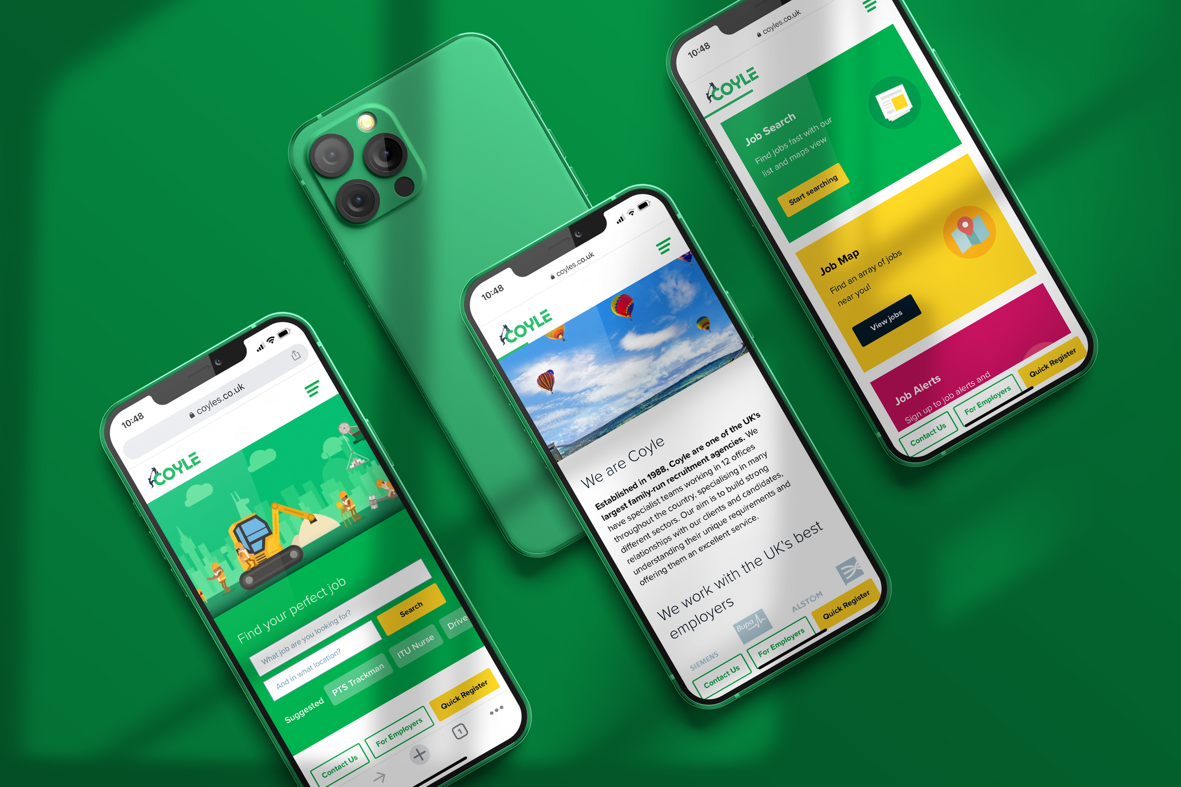
The core design challenge was figuring out how to humanize a massive corporate entity. It was critical that the unified brand didn't feel cold, rigid, or overly institutional. The visual language I developed focused heavily on remaining friendly and accessible while elevating the aesthetic to feel distinctly modern.
Friendly, Accessible, Modern
- Unifying brand materials.
- Developing a welcoming visual language.
- Ensuring consistency across healthcare, rail, and tech sectors.
Standout UX: The Commute Calculator
A job hunt isn't just about the title or salary; it is about the daily reality of the role. To add profound practical value to the candidate experience, I designed a custom commute calculator directly on the job detail pages.
This feature allowed users to instantly calculate their exact travel time to the job site, complete with granular toggles for walking, cycling, driving, or taking public transport.
The Outcome
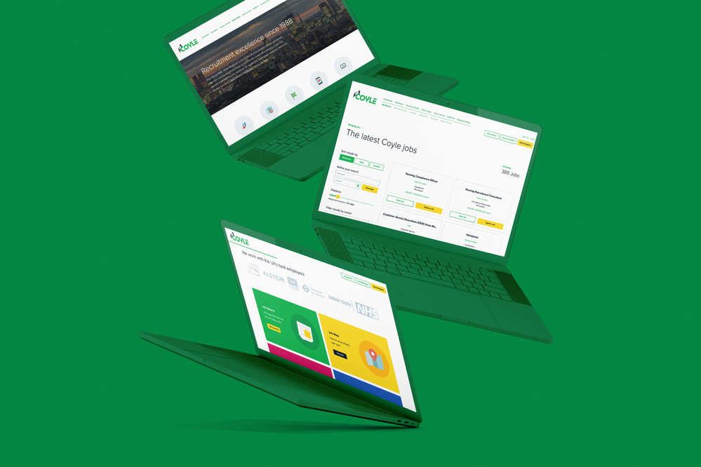
The ultimate payoff was seeing this massive, multi-faceted project come together flawlessly in the real world. The cohesive launch of the newly designed website, modern print materials, and custom animations successfully established a unified brand message that feels distinctly human.